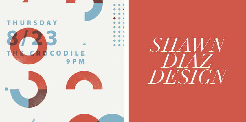
Designer Feature: Shawn Diaz Design
Shawn Diaz, one of Greenvelope.com’s OG designers and the brains behind our 2014 rebrand, offers a design collection with a range that dances between supremely silly and effortlessly elegant. Shawn’s work exemplifies his keen eye for typography and color. Today we are excited to learn a bit more about the man behind the playful designs.
Your “day job” is working as an Art Director at a Seattle advertising agency, so what is it that you like about designing stationery?
I like the opportunity to step away from all the hustle and bustle of big business stuff and just do fun, simple, and sometimes silly as heck designs for parties. ‘Cause, y’know… Who doesn’t like to party?
What other forms of art do you do?
I used to shred hard on American electrical rock guitars, but I haven’t done that for a while. Sometimes I paint portraits and sometimes I invent new and innovative dance moves that nobody has ever seen before. That’s art, right?
Your Greenvelope designs are so unique – do you have a favorite?
I like It’s bro time bros! because I think it’s funny, but as far as looks go I like the Vegas one and the simple Please Join Us design. The Let’s Party one is cool too.

The stationery industry is largely female-dominated, do you have a favorite dude designer or typographer?
Armin Hofman, Alan Fletcher, Herb Lubablin and other guys from the ’50s and ’60s are great typography dudes. There’s also fine artists and illustrator/designers that use type in great ways like Lawrence Wiener and Chris Von Szombathy. Shegio Fukada is one of my favorite all time designers. I get pumped when I see great graphic design and find out that some old dude made it like 60 years ago. It’s like, “Dang dude! That old guy is cooler than all of us!!!”
Big thanks to Shawn for taking the time to share his insights, story, and general awesomeness with us today. If you want to browse his full collection on Greenvelope, click here.


