Using One Template for Multiple Events
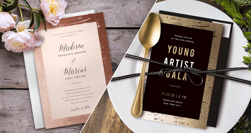
One of the best things about our designs is that they’re fully customizable (and seriously gorgeous). Whether you want to upload your own design or tailor one of ours, every invitation can transform to match both your personal style and your particular event. Most of our designs are versatile enough to work for more than one type of event, so don’t shy away from exploring multiple design categories. In fact, most of our designs contain header text that can be easily customized with verbiage that reflects your event. So whether you’re planning a dinner party, bridal shower, or corporate event, keep in mind that many of our designs can be used beyond their listed categories.
To help spark some inspiration, we’ve put together examples of two templates that have been uniquely personalized for different events.
When thinking about adjusting templates for your events, there are a couple of key factors that you can change to make a big impact:
- The colorway (which you can select on the design browsing page)
- The wording (customize to your unique event!)
- Typeface (select from script, handwritten, serif, or sans serif)
- The font colors, sizing, spacing, and orientation
- The overall layout (from top to bottom!)
- Imagery and logos (we recommend using a transparent .PNG for a logo. Also, if you want to include photos, we have photo insert templates that are best suited for that)
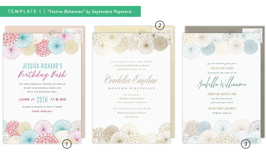
Festive Bohemian by Septembre Papeterie
The graphic illustrations of paper fans, garlands, and honeycomb blooms make a festive and versatile invitation that adds a chic, bohemian touch. While originally designed as a wedding invitation, we think that it is suited to way more events than that!
- Birthday
Designed to celebrate another year for the fictitious Jessica Richards, this birthday invitation features a pink colorway option (because in this fake scenario, that is Jessica’s favorite color!) The layout here is complemented by both script and serif fonts to help break up information and draw your eyes to the key details. Varying colors and sizing, particularly in the header text, adds a lighthearted, playful touch. - Bridal Shower
This bridal shower invitation for Cordelia Emeline features the beige & gold colorway option. For a more elegant occasion, neutral and gold sets the perfect tone. The size and color of the text is consistent throughout the invitation, creating a traditional, understated elegance. The pop of script for the name draws your eye and adds a soft, feminine touch to the overall design. - Baby Shower
For celebrating a baby shower, we love the idea of branching out into styles that aren’t explicitly baby-related. The balance of blue and beige in this design makes it a lovely fit for a boy or gender-neutral shower. By utilizing italics and varying colors within three handwritten typefaces, the information on this invitation comes across as poised yet playful.
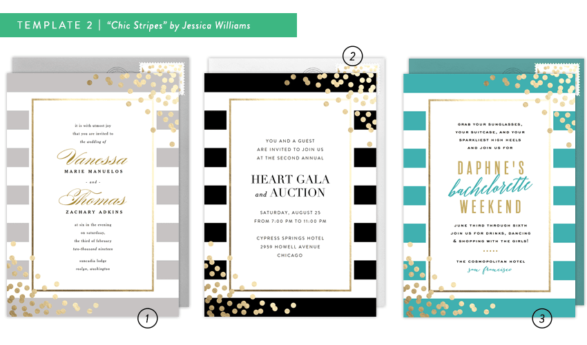
Chic Stripes by Jessica Williams
This striped invitation, complete with fun metallic accents, is the perfect way to announce your event.
- Wedding
For this particular wedding, the gray colorway option with the gilded border and confetti corners creates a warm, romantic feel. By using a beautiful script font, the soon-to-be-wed couple’s names become the focal point of the invitation. Balanced by delicate serif and sans-serif fonts, the layout is easy to read and effortlessly elegant. - Professional Gala
Designed for a corporate gala and auction, this invitation stands out in a bold black colorway. While the serif typeface used for the event title gives a traditional feel, the details in a sans-serif complement the overall modernity of the design itself. With clean lines, neutral colors, and simple typefaces, even a professional event can benefit from that elegant pop of gold confetti. - Bachelorette Weekend
By using the teal colorway option paired with fun, energetic script in the heading, this design goes from professional to “party time!” in a flash. We pulled some more of the gold from the design into the text and added the teal and a tilt to help set the tone for a lively, fun-filled weekend. By using black for the bulk of the details, the additional pops of color feel balanced instead of overwhelming.
As you can see in these designs, there were a lot of varying typefaces used and it helped make a big difference in the tone and style of the template. When choosing typefaces, a couple words of caution and things to keep in mind:
- No more than three typefaces per invitation
- Be careful about using two typefaces that look similar
- Consider legibility when using script. Script is best suited for large text.
- Consider the feeling of each typeface. For example, opt for script over handwritten for an elegant event, or a sans-serif over serif for a more modern feel.
Once you find that perfect design, don’t hesitate to add a touch of personalization. You can browse a bunch of inspiring invitation designs here. You’ll be on your way to collecting RSVPs in no time!
