17 Stunning Wedding Color Palettes for Your Special Day
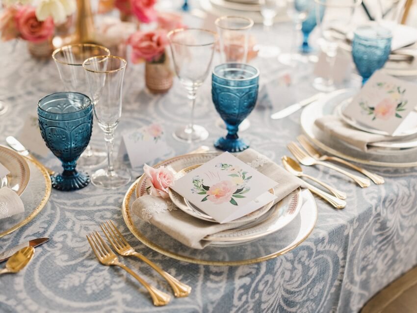
You might have an idea for a color you’d love to feature on your wedding day, but how do you transform that into a complete wedding color palette?
If you’re not sure where to start, you’re in luck. We’ll talk you through some of the ways to find your dream wedding color palette, along with some of our favorite color schemes and invites to match.
How to Choose the Perfect Wedding Color Palette
Your wedding color scheme will be brought to life through your outfits, wedding decor, linens, wedding invites, and wedding reception styling. You’ll see it everywhere, which is why it’s a good idea to decide on your color palette before getting too deep into wedding planning.
To help you choose a color palette for your big day, here’s our best advice on where to find inspiration.
Consider Your Favorite Colors
One of the first places to start is by considering what your favorite colors are. Sit down with your partner and discuss the colors you love — and also the ones you can’t stand so that you don’t plan a wedding color palette that features them.
This exercise might help you find a primary or focus color to build your palette around, or you might walk away from it knowing what your ideal wedding color scheme is already.
Look Around You
As you move through daily life, take notice of the objects, places, and scenes that catch your eye. Remember which colors, patterns, textures, and styles you’re most attracted to, and write them down.
Understanding which colors and themes you’re drawn to can help you build your wedding color palette, and it makes the whole process feel even more personal too.
Be Inspired by the Season
Many couples like to center their wedding colors around the season of their special day. This is a good place to start as it’s easy to narrow down potential colors and create a shortlist of looks, styles, or themes that you love.
While you can take inspiration from the season, don’t feel like you have to be limited by it. It can also be fun to do the opposite and choose a surprising color palette — like a festive vibe in the middle of summer or pretty pastels for a fall wedding.
Look at Real Weddings for Color Inspiration
Another great place to find inspiration for your own wedding color palette is by looking at other people’s real weddings. This is one of our favorite things to do, not just for color ideas but overall styling ideas too.
Browse through a collection of real wedding photos and either keep your options open or narrow your focus by type, such as:
Take inspiration from the colors they choose, how they use them, and how the couple has used elements like greenery and natural backdrops to make colors stand out.
17 Stunning Wedding Color Palettes with Matching Invitations
All this talk of wedding color combination inspiration is exciting! If you’re eager to start finding your perfect color palette, here are some of our most-loved ideas to help you.
For each color idea, we’ve paired it with a suggested invite, so you don’t have to go looking any further for a stunning matching digital invitation. Every design is easy to customize too, and you can even work with our design team to bring your exact wedding hues to your invites.
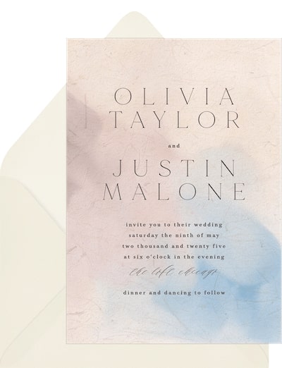
1. Dusty Blue and Pink
Design: Creo Study
Suggested invitation: Painterly Glow Invitation
Create a romantic or boho ambiance for your big day by pairing dusty blue with a similar shade of pink. These two colors work beautifully together alongside a soft neutral, like an off-white or cream.
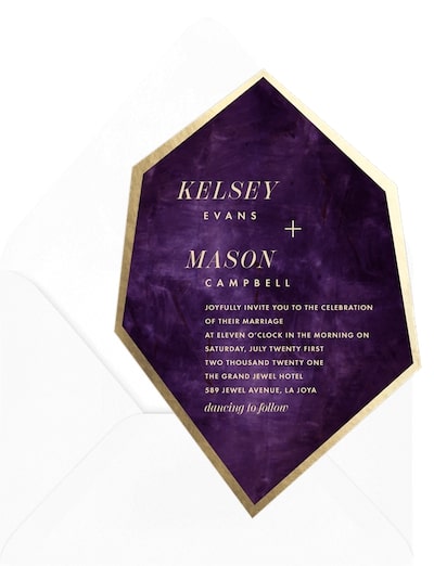
2. Jewel Tones
Design: Claudia Owen
Suggested invitation: Modern Gemstone Invitation
A combination of jewel tones gives you one of our favorite fall wedding color palettes. Rich purples, reds, greens, and blues are always a hit for this season, but they work equally well for any day of the year.
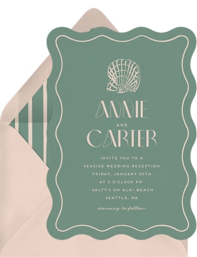
3. Sage Green and Peach
Design: Kid Collective
Suggested invitation: Wavy Seashell Invitation
Peach and sage green together feel light and airy, making it a wonderful color combo for a spring wedding or an early summer wedding. Take your inspiration a step further and find a way to feature peaches within your big day, either through your wedding desserts or your table decor.
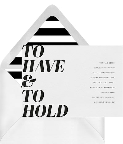
4. Black and White
Design: Up Up Creative
Suggested invitation: To Have and To Hold Invitation
For the ultimate sophisticated or minimalist wedding theme, you can’t go wrong with black and white. It’s a timeless wedding color combination that never gets old.
5. Rainbow Colors
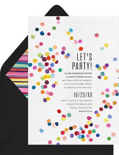
Design: Signature Greenvelope
Suggested invitation: Confetti Burst Invitation
Bring out all the vibrant colors of the rainbow for this eye-catching wedding color palette idea. Adding in rainbow colors makes your big day feel even more joyful and fun.
6. Dusty Rose and Mint Green
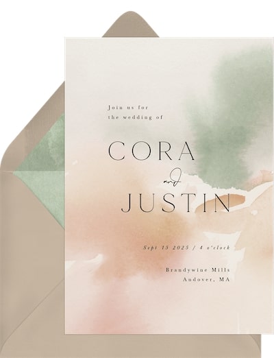
Design: Jennifer Wick
Suggested invitation: Ethereal Wash Invitation
For another sweet spring wedding color idea, pair dusty rose with mint green. The soft, delicate hues work together so well and can feel whimsical, romantic, or elegant, depending on how you style them.
7. Navy Blue and White
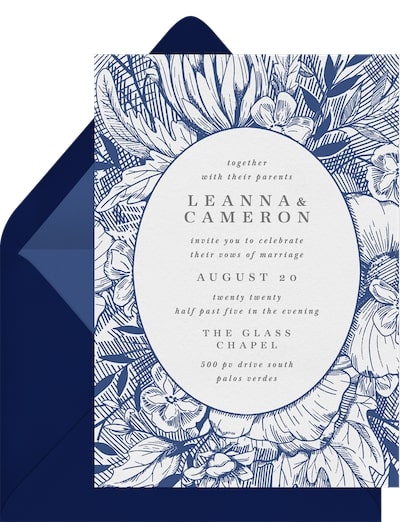
Design: Becky Nimoy Stationery
Suggested invitation: Inked Florals Invitation
Another classic wedding color combination is navy blue and white. You can dress this up as a nautical theme or use the colors for a classic or traditional wedding.
8. Earth Tones
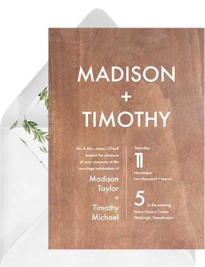
Design: Loree Mayer Design
Suggested invitation: Wood You Love Me Invitation
Earthy tones like greens and browns are perfect for a rustic wedding or when your wedding venue is outdoors. Introduce pops of color through delicate blooms or your table decor, or stick completely to earth-inspired tones.
9. Mauve and Green
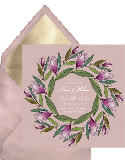
Design: Becky Nimoy Stationery
Suggested invitation: Lily Magnolia Wreath Invitation
If you’re into muted tones, we love the color combination of mauve with a shade of muted green like dark or olive green. To add more colors to the mix, we recommend a dusty blue, soft lilac, or muted brown.
10. Teal and Orange
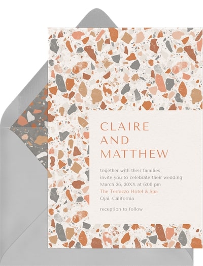
Design: Jen Montgomery
Suggested invitation: Trendy Terrazzo Invitation
One of the best summer wedding color combos out there is teal and orange. It’s such a vibrant, joyful mix of colors that works beautifully for an outdoor wedding ceremony.
11. Burnt Orange and Coral
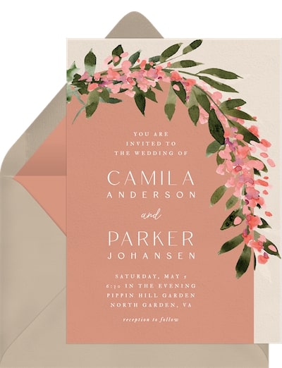
Design: Lissa Anglin
Suggested invitation: Arbor Blossoms Invitation
If you’re a fan of bold colors, you have to try coral and burnt orange together. These colors give you a lovely way to add vibrancy to your special day, without having to choose primary colors. We love this look for a tropical wedding.
12. Lilac and Gray
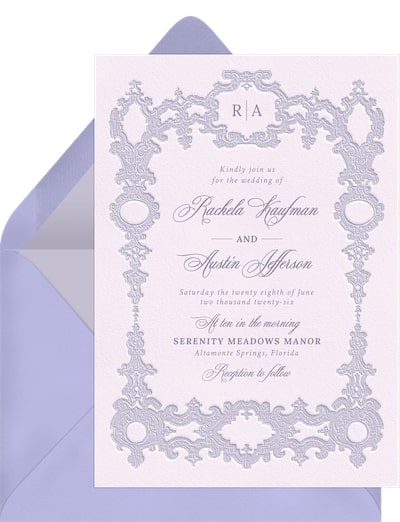
Design: Claudia Owen
Suggested invitation: Sophisticated Frame Invitation
For a more understated look, pair lilac with a soft gray. This look feels romantic and vintage, especially if you style it with the right wedding decor, wedding attire, and reception venue.
13. Royal Blue and White
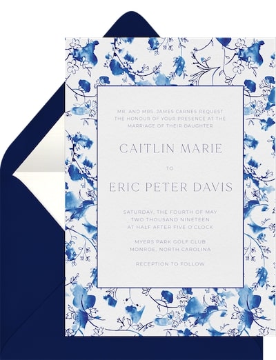
Design: Dear Kathryn
Suggested invitation: Blue China Invitation
Blue and white work well together, and this color combination has us dreaming of a summer in the islands. It’s a fun way to add visual interest to your wedding celebration or create a Mediterranean vibe.
14. Terracotta and Rose Gold
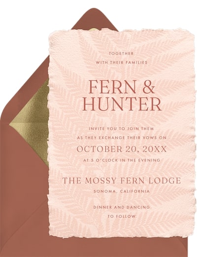
Design: Jen Montgomery
Suggested invitation: Pressed Fern Invitation
If you’re looking for a luxurious take on rustic or boho weddings, try mixing terracotta with rose gold. The rich, earthy tone alongside the glamorous rose gold feels sophisticated and romantic.
15. Pine Green and Soft Blue
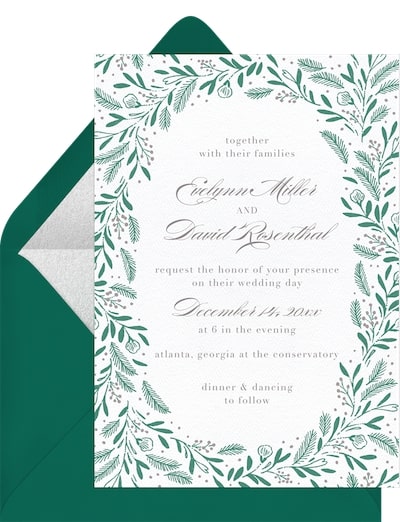
Design: Paper Raven Co.
Suggested invitation: Pine and Holly Invitation
When it comes to winter wedding colors, here’s one we adore — pine green and soft blue. It’s perfect if you want a festive feel but don’t want to go with a traditional red, white, and gold color palette.
16. Shades of Pink
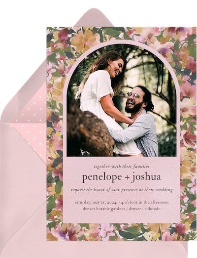
Design: Laura Bolter Design
Suggested invitation: Lush Floral Arch Invitation
If you’re having a pink-themed wedding, you need a color palette to match. Dress your bridal party in shades of pink, have a pink ombré wedding cake, and fill your wedding bouquet with matching shades. Not only is this fun, but it makes for stunning wedding photos.
17. Pastel Hues
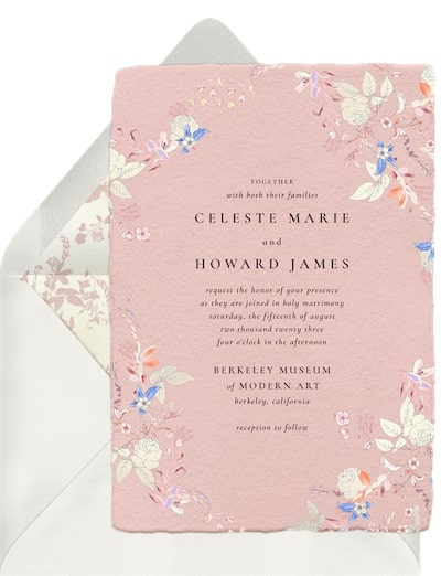
Design: Plum Pretty Sugar
Suggested invitation: Endless Love Invitation
Last but not least, we’ll leave you with one of the most popular wedding color palette ideas — pretty pastels. This look is ideal for a whimsical or fairytale wedding style, and it’s easy to find matching wedding decor and floral arrangements for this sweet, romantic color scheme.
Create Your Own Dream Wedding Color Palette
Choosing your wedding color palette is one of the most fun, creative parts of the planning process. Use this guide to help you find dreamy wedding color ideas for your wedding ceremony, reception, floral arrangements, and invites.
Once you’ve chosen your colors, seek out one of our wedding invitations to match. Filter by color to find designs that complement your chosen palette, or work with a Greenvelope designer to create a bespoke invitation that matches your colors.
